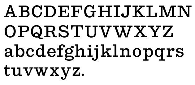
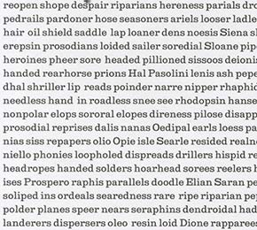
Current character set (still in progress).
Digital Typeface
(work in progress)
A warm and round slab serif typeface reminiscent of 1840s British typefaces. It was designed to be used at small sizes in running text such as a paperback novel.
Done under advisement of typeface designer Berton Hasebe.
Kensington Slab
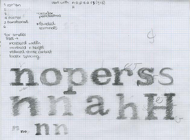
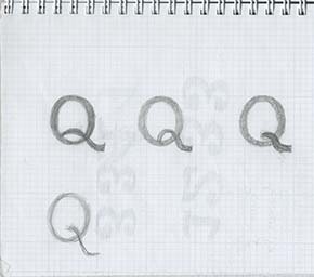
Initial sketches of Kensington. After researching into Clarendon and other slab serif typefaces, and also doing research into weight and proportion of text typefaces, I started drawing by hand to get a general idea of what the typeface would look like.
Different sketches exploring form
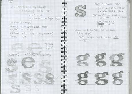
A few characters in, I realized that the typeface was too heavy for text, so we ran it through an interpolation software to get three new instances to pick from. The typeface needed to be thin enough to be enjoyable to read, but it also had
to maintain the warmth and roundness that
the weight provided.
Original weight: Top left
Current weight: Bottom left
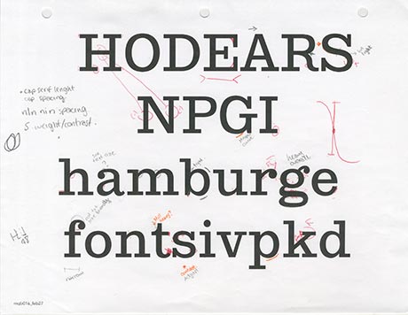
Process: 27 February, 2015
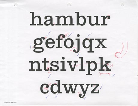
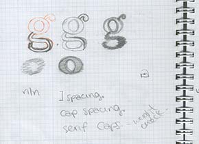
Process: Lowercase. 20 March, 2015
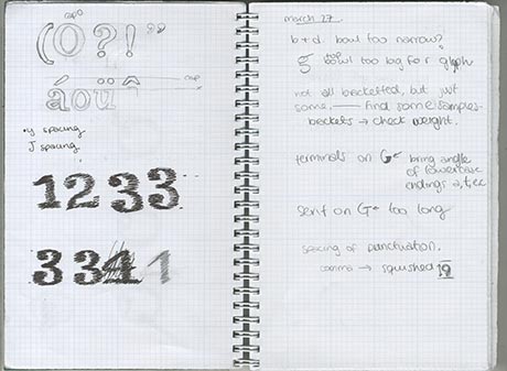
Process: 27 March, 2015. Initial sketches for punctuation, accents and figures, and notes on improvement for the existing character set.
Next